Why do I have large spikes in my graph when using the change aggregation function?
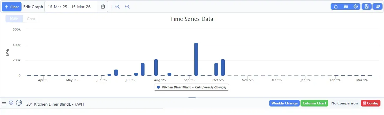
Sometimes, graphs using the change aggregation show large positive or negative peaks. For example, the time series graph below shows energy usage peaking at 400 MWh — which would require a small power station. In this situation the real data is drowned out, making the graph unusable.
Cause 1: Random noise in wireless transmission
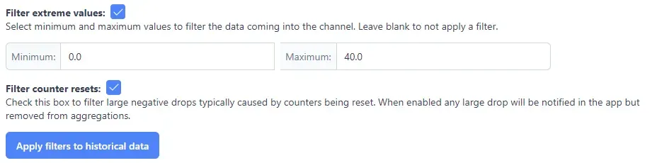
Spikes can be caused by random noise in Z-Wave or Zigbee transmissions. This causes the difference between the starting and ending sample values to appear extremely large, even though no real change occurred. This type of noise can be filtered out using the channel configuration in ConstantGraph.
Cause 2: Counter resets on energy meters
For Energy (kWh) channels, there is also an option to filter out counter resets. Energy meters count the total kWh consumed and increase monotonically over time.
However, if a meter is reset or unplugged (depending on the model), the counter may return to zero. ConstantGraph then sees a massive apparent drop in energy use and shows a large negative spike in hourly, daily, or weekly change aggregations.
Both types of spike can be suppressed using the filter options in the Channel Configuration page.
Applying filters to historical data
Once you have configured and saved your filter settings, click the Apply filters to historical data button to correct any existing spikes in historical data.
Going forward, the filter settings will be applied automatically to all new incoming data.
Tip: If you are unsure which cause applies, check your channel configuration for the affected channel — enabling both the noise filter and the counter reset filter is safe and has no negative effect if one does not apply.